Responding to the customer
With the increased purchase and use of smart phones/tablet devices as a primary browsing device, businesses are becoming more and more aware of providing mobile solutions that allow customers to interact with their services and products, wherever and whenever they choose. A 2012 survey carried out by Google found that 72% of consumers want mobile-friendly sites.
"If a site works well on a mobile phone, I'm more likely to return to that site in the future." (Google, 2012)
In addition, the mobile device is now the primary channel customers use to interact with the web. But these customers are not always accessing the internet 'on-the-go', or only wanting a cut-down version of the full desktop web site experience.
"The notion that you should create a separate, stripped-down version for the mobile use case might be appropriate if such a clean mobile use case existed, but it doesn't... Mobile isn't just 'mobile'. It's also the couch, the kitchen, the three-hour layover, all places where we have time and attention to spare. Those aren't 10-second sessions. That means we shouldn't design only for stunted sessions or limited use cases." (Josh Clark, 2012)
Strategies around the delivery of mobile solutions has moved on from delivering a web site for desktop browsers and a separate mobile-specific site (commonly known as a 'm.dot' site). More businesses are now moving towards delivering a single site with a responsive design approach that responds to the physical pixel size of different devices. This approach delivers a user interface (UI) that is optimised to the pixel size of the device being used.
"Rather than tailoring disconnected designs to each of an ever-increasing number of web devices, we can treat them as facets of the same experience. We can design for an optimal viewing experience, but embed standards-based technologies into our designs to make them not only more flexible, but more adaptive to the media that renders them." (Marcotte, 2010)
This approach is a natural progression of the HTML and CSS technologies used in browsers to render the physical UI layer. But it still does not address some more fundamental issues; how can businesses add value for customers once the UI has been resized? And, how can a business respond to the intent and behaviour of its customers, and not just cater for the pixel dimension limitations of a device?
The responsive design approach does not answer the question of how businesses can respond to the need, or intent, of the customer - what I have called 'responsive intent'. This is not a mobile-only issue; but needs to be cohesively addressed for the user experience across all online channels.
The Waiter scenario
Comparing the responsive intent concept to the desired experience we expect to have in a restaurant will help to frame the idea of a two-way contextual interaction.
Imagine you visit your regular restaurant at the weekend and are greeted by Fredrick, your waiter, when you enter the establishment.
He'll greet you, by name, and ask how you are; how your day has been and generally make you feel welcome at the restaurant. After seating you he may ask you if you wish to start with your usual refreshment. He may also ask if you want to order your usual main dish and starter. This is based on his knowledge of you, and your ordering habits.
But he's also able to adapt a standard order so it's not just a 'one-size-fits-all' approach. For example, Fredrick knows you like a certain pasta dish, but dislike Parmesan cheese. So when he places your order with the chef he makes sure to note this. So a standard order is tailored to your personal taste.
However, during this visit you fancy something different for a change, and ask Fredrick to recommend something from the menu. He is likely to respond with other suggestions based on previous visits to the restaurant and his knowledge of what you like and dislike. So his suggestions are based on things that are related to previous choices – and not simply wild guesses.
If you still prefer something quite different (to Fredrick's suggestions) and revert to the menu, then Fredrick could possibly provide you with some additional details about each dish – "If you like oily seafood, then that one is good", "Oh, I find that one a bit hot", or "That portion is very large. You may want to split it between your party".
The point is Fredrick responds to your needs and doesn't simply hand you a menu and walk off. How good would this experience be if all businesses were this friendly?
Customer experience is based on how a business responds to the customer. It exists to ensure each interaction is meaningful, positive or has a desired outcome. So what if our online customer experience was matched with an appropriate responsive proposition that was tailored, and adapted, to the needs of our customers?
Responsive Intent
This concept of responsive intent goes beyond merely resizing and hiding non-essential UI elements as the pixel area available is reduced when customers move between desktop, tablet and mobile devices. Instead, it focuses on how the UI can be personalised to deliver a unique customer experience.
If a customer usually links to the same 2 or 3 sections on a web site, then why not present these commonly used sections as the default homepage or dashboard view for returning visits? If a company can track what is important to its customers, then presenting specific views, functionality, links and content can enhance each customer experience.
Intent can be defined as;
- firmly or steadfastly fixed or directed, as the eyes or mind: an intent gaze.
- having the attention sharply focused or fixed on something: intent on one's job.
- determined or resolved; having the mind or will fixed on some goal: intent on revenge.
- earnest; intense: an intent person.
(dictionary.reference.com/browse/intent, 2012)
The waiter scenario above described the ideal experience we all expect to receive as valued customers. But most online services today are based on an Operant Conditioning model – reward the customer when they do something correctly (reinforced with positive feedback) and punish or negatively reinforce behaviour we do not wish them to repeat (negative feedback). This puts the onus of 'learning' how the UI works, and also adapting to certain flows and sequences firmly on the customer.
Even with improved and customer-centric messages it is still hard to mask the Operant Conditioning nature of most web interfaces.
Intent and behaviour can clash when a business requires their customers to engage in online services, tasks and sequences. Strongly sequenced, or task-orientated, interfaces have served us in the past for simple flows. But, this approach does not allow for more contextually rich interactions and deeper customer experiences (especially when the desired customer experience may be non-linear).
Responsive Intent - an online banking example
In the wireframes below I have drafted a simple illustration of how the landing page of a banks online banking could move from traditional layout to one that employs a responsive intent approach.
These diagrams are not meant to demonstrate a visual design approach, merely to illustrate how a business can respond to its individual customers and deliver a user experience that meets their needs.
Figure 1 is a typical online banking landing page for Anna, which presents standard menus, account balances and financial messages.
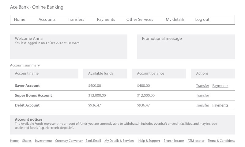
Fig 1. A typical online banking customer view for Anna
Figure 2 shows the typical approach many banks use to organise various sections within drop-down menus. The challenge with this approach is frequently used items tend to get buried and new added functionality can often go unnoticed. The three common areas Anna usually accesses are circled in red.
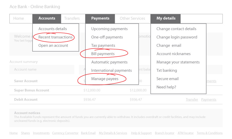
Fig 2. Common functional areas that Anna usually accesses
Figure 3 demonstrates how a responsive intent approach uses Anna’s commonly accessed items to form the main landing page links. Full access to all areas of the online banking site can be accessed from the “+ More” link. In addition, financial and timely messages are now accessible below the message icon near the top right of the screen. The account balance information has been placed within discrete tiles. Access to full account details, or transactional functionality could also be achieved by selecting an account name (or tile).
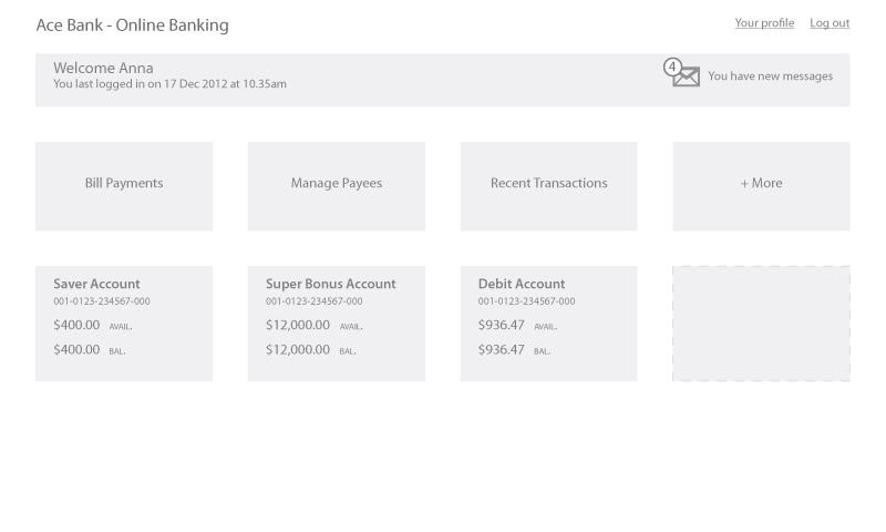
Fig 3. A responsive intent approach for Anna’s online banking landing page
Figure 3b below illustrates how a new promotional campaign can appear above the responsive intent menu. Timely promotions are not competing against an over-crowded UI.
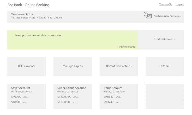
Fig 3b. A new product/service promotional message
Figure 4 illustrates how this approach is employed on a mobile device.
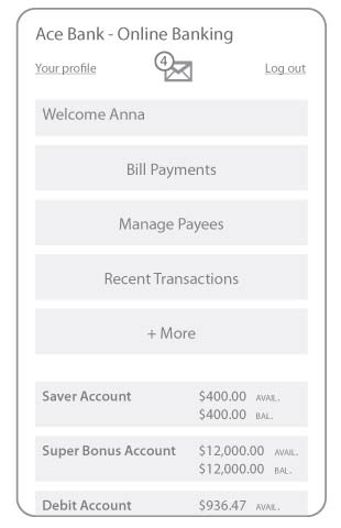
Fig 4. A responsive intent approach for mobile (landing page)
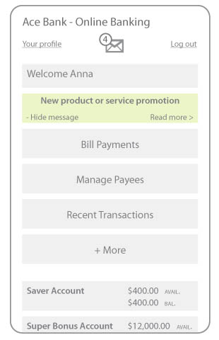
Fig 4b. A new product/service promotional message on mobile
The responsive intent approach can also be used in traditional online payment flows. For example, it could be used to allow customers to enter a contextual payment message that could look for key words to construct the full payment instruction. Key words could include verbs, saved payee names, dates, payment reference details, amounts and also the account to pay from.
Figure 5 below shows a traditional online payment form used by many banking organisations today.
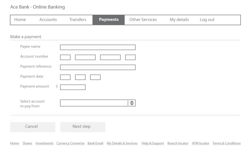
Fig 5. A typical online banking domestic payment form
Figure 6 shows how a customer can enter a contextual payment instruction. Key words and pattern recognition could then be used to construct a full message that will complete the payment. The 'Next step' could include a confirm payment presentation to allow the customer to confirm or change any details.
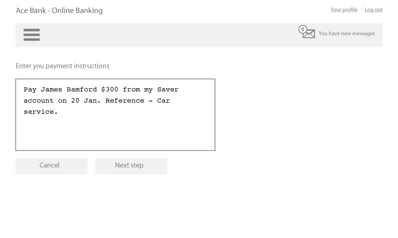
Fig 6. A responsive intent approach to creating an online payment
Figure 7 below shows how this layout could be handled on a mobile device.
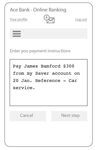
Fig 7. A responsive intent approach for mobile payments
References:
72% of Consumers Want Mobile-Friendly Sites: Google Research
Miranda Miller (2012)
Retrieved 04 Jan. 2013
Nielsen is wrong on mobile
Josh Clark (2012)
Retrieved 04 Jan. 2013
Responsive Web Design
Ethan Marcotte (2010)
Retrieved 17 Dec. 2012
Intent
Dictionary.com, LLC. (2012)
Retrieved 17 Dec. 2012
Theories of Learning in Educational Psychology
B. F. Skinner (1904 - 1990)
Operant Conditioning
Retrieved 19 Dec. 2012
Operant Conditioning
Wikipedia.org
Retrieved 19 Dec. 2012


